2/20/2026
Self-initiated redesign of a complex banking interface
By Kenneth KafunyaThis self-initiated redesign addresses systemic friction within the FNB mobile banking app’s transfer experience. User feedback revealed recurring frustration caused by cluttered interfaces, unclear navigation, and slow performance perception.
Role: The design spectrum
Focus Areas: Clarifying core tasks and reducing friction in the transfer flow
Primary Metric: Task Completion Rate (Transfers)
CONTEXT
The F.N.B mobile banking app serves everyday customers who rely on digital services for essential financial tasks such as transfers, balance checks, and bill payments.
In a competitive digital banking landscape, usability directly impacts retention and trust. When core tasks feel complicated or unreliable, users are more likely to disengage or consider alternative providers.
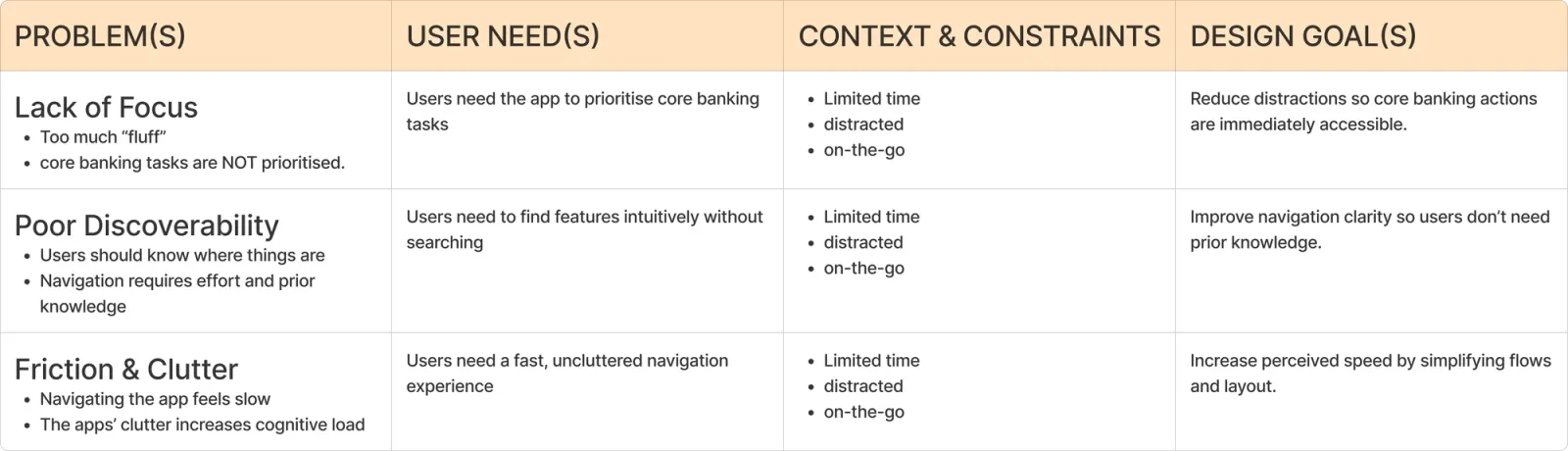
THE PROBLEM
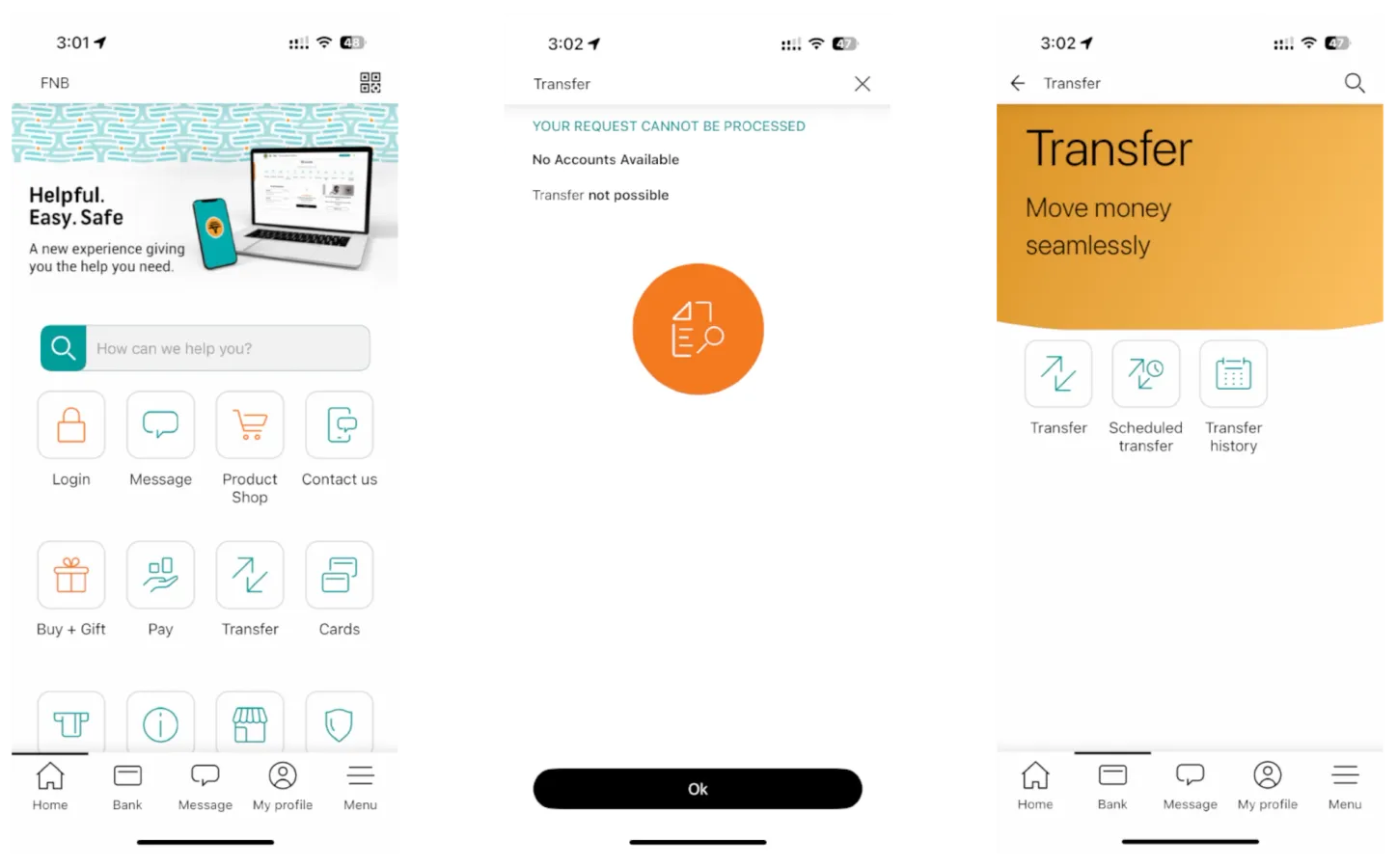
The current transfer experience increases cognitive load by presenting competing actions, unclear hierarchy, and mid-flow decision points. This results in slower task completion, user uncertainty, and reduced confidence in the platform’s reliability.
RESEARCH & INSIGHT SYNTHESIS
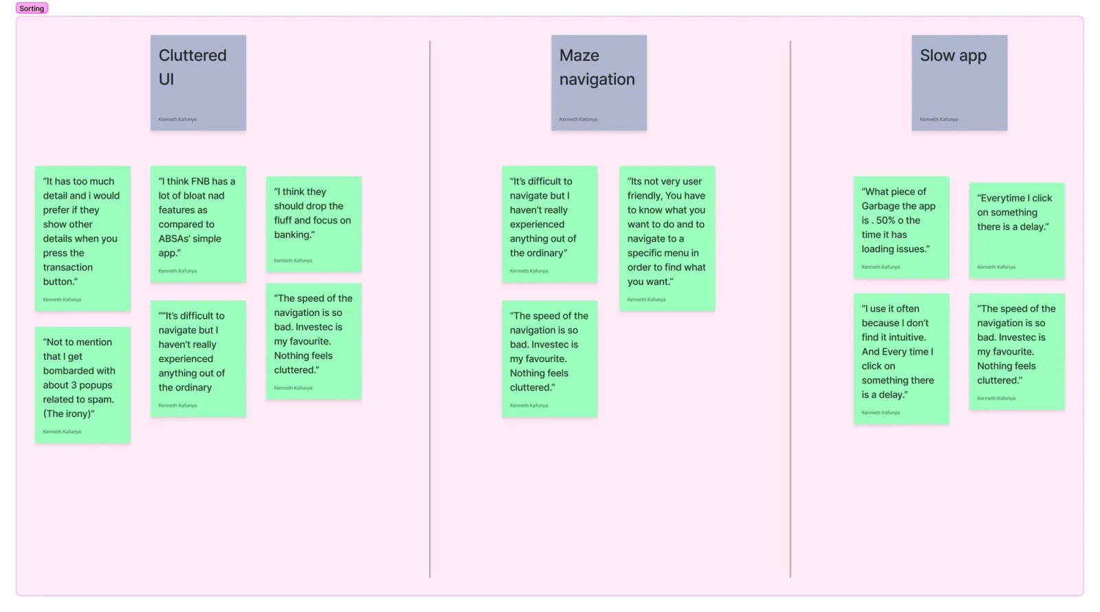
Raw Feedback Themes
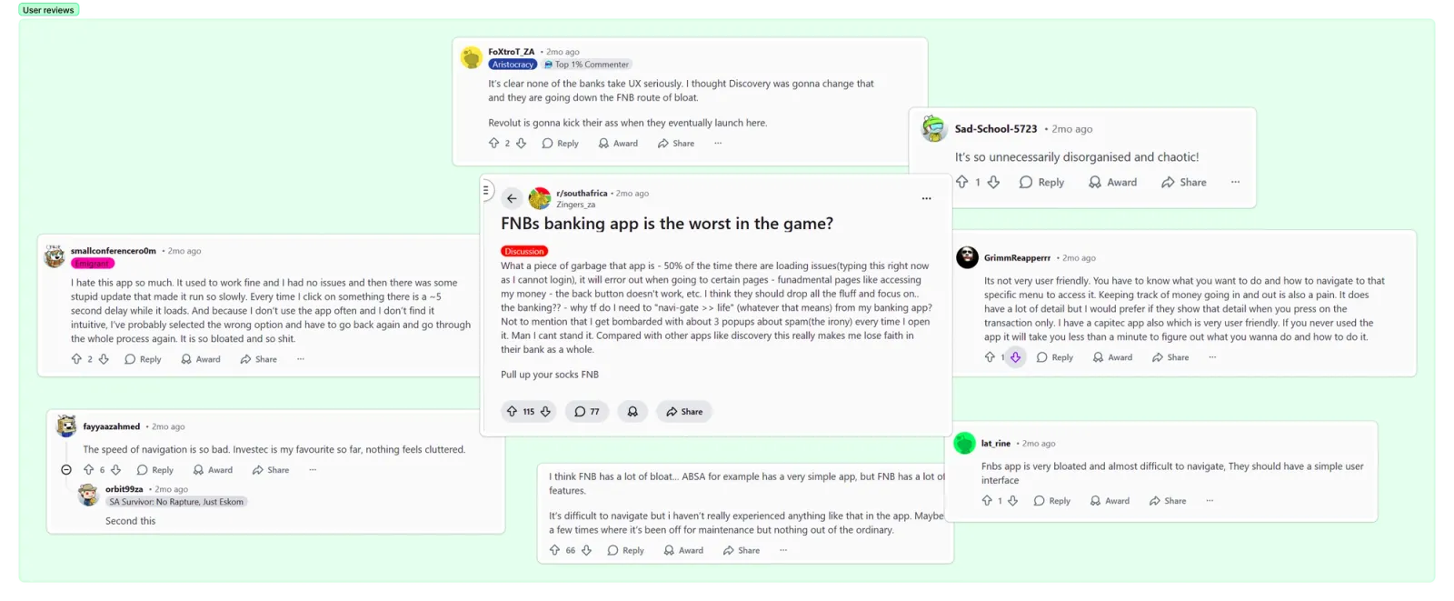
My wife and I both use F.N.B and compared how each of us experiences the app from our own accounts. I then reviewed real user feedback from Reddit threads to identify recurring frustrations.
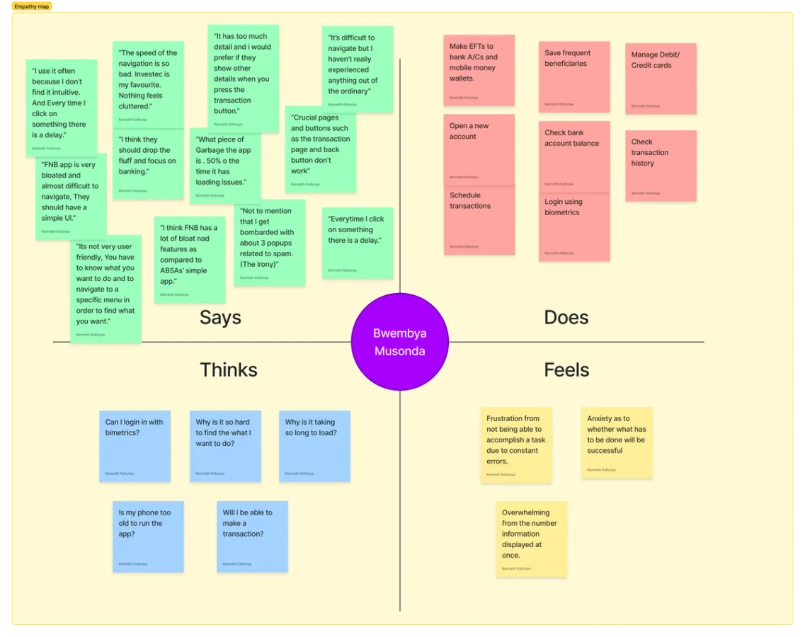
Emotional Pattern
Empathy mapping revealed a consistent emotional pattern: users felt overwhelmed, uncertain, and frustrated during routine tasks.
Core Friction Diagnosis
User reviews consistently referenced:
- Cluttered UI
- Maze-like navigation
- Slow responsiveness
The issue was not missing functionality — it was lack of prioritisation. Core actions competed visually with secondary features, increasing decision fatigue and cognitive overload.
STRATEGY
Strategic Focus (Why Transfers)
Transfers were prioritised because they are High-frequency, High-risk, Directly measurable and Closely tied to user trust. Improving this flow offers the highest immediate impact on task completion and perceived reliability.
Product strategy
To address systemic friction, the redesign focused on four guiding principles:
- Prioritise core banking actions over secondary content
- Reduce decision fatigue through clearer hierarchy
- Improve navigation predictability
- Optimise perceived speed and feedback responsiveness
SOLUTION EXPLORATION
Primary flows
I focused on refining the overall user flow to ensure the navigation was logical and intuitive before moving into visual design. The process focused on iterating the bank and mobile money transfer flows, using them to shape the foundation of the experience. This approach helped clarify exactly how many screens were needed and prevented unnecessary design work.
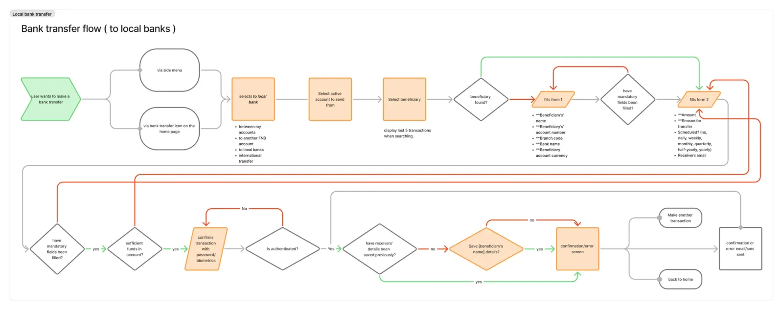
Local bank transfer - flow
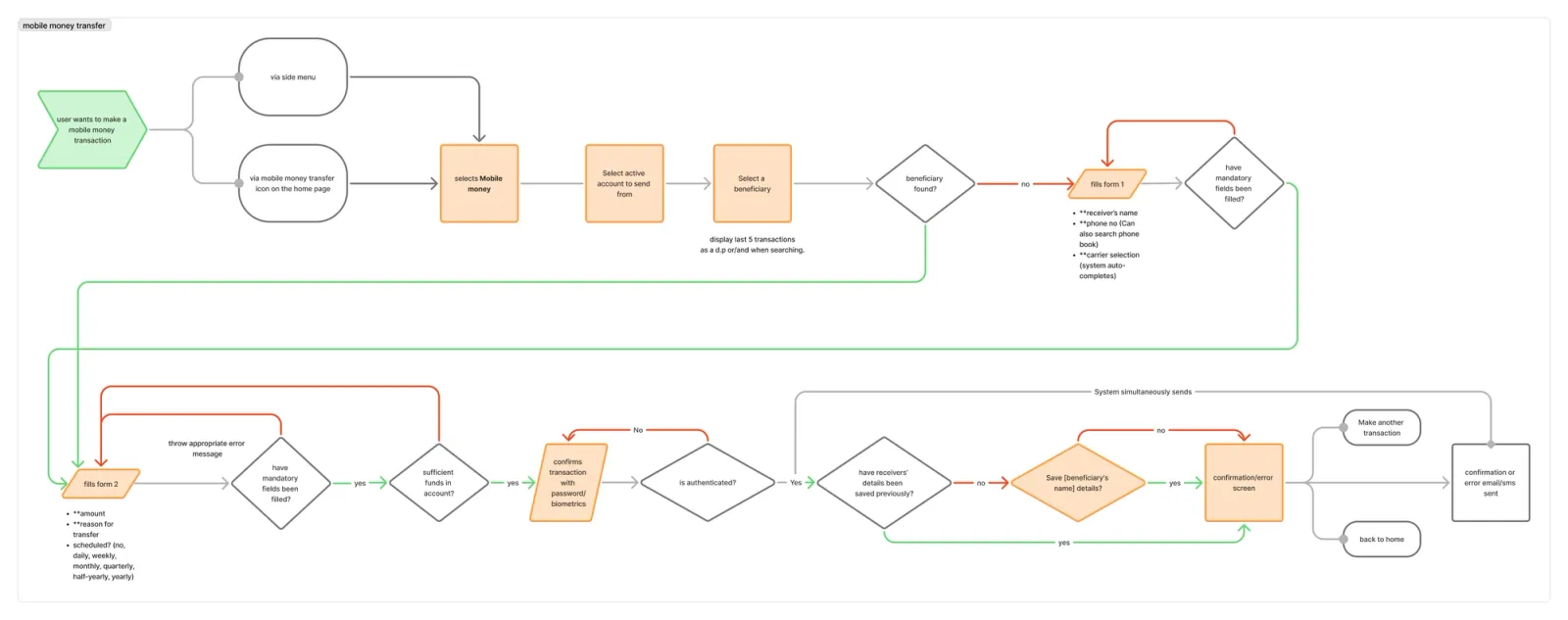
Mobile money transfer - flow
Secondary flows
To validate the flows, low-fidelity shapes were replaced with wireframes to make usability clearer.
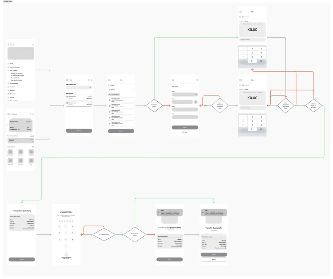
Local bank transfer - flow
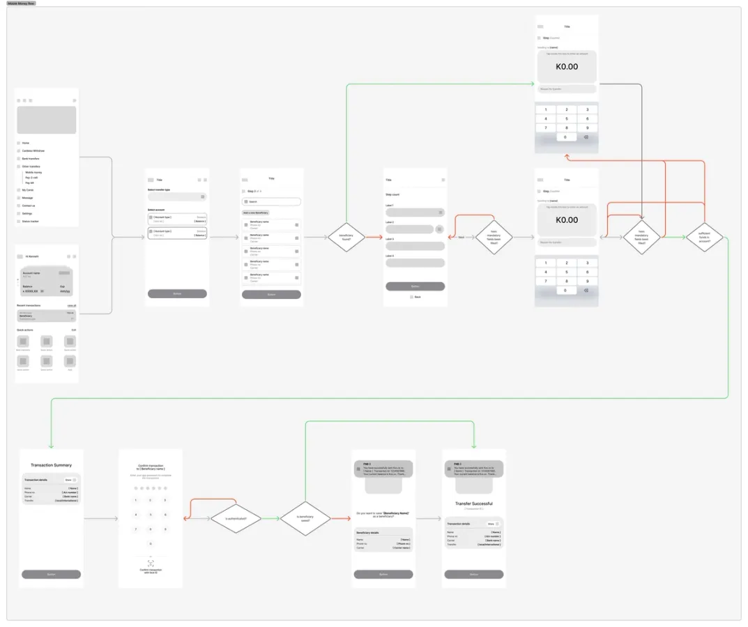
Mobile money transfer - flow
SOLUTION OVERVIEW
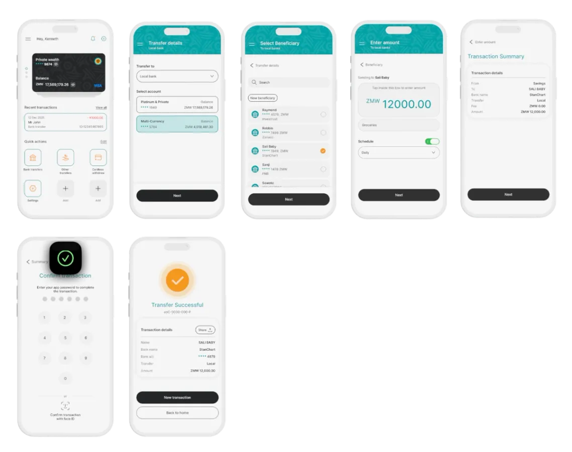
The redesigned interface elevates primary actions such as transfers and balance visibility while minimising competing visual elements.
Key improvements include:
- Clearer action hierarchy
- Simplified transfer flow
- Reduced visual clutter
SOLUTION BREAKDOWN
Hierarchy & Focus
Primary actions such as Transfers and Balance visibility were elevated. Secondary features and promotional content were deprioritised to reduce visual competition.
Potential impact:
- Faster scanning
- Reduced cognitive load
- Clearer action entry points
Flow Simplification
The transfer sequence is structured as:
Funding Source → Recipient → Amount → Confirmation
This aligns with real-world financial decision order and reduces mid-process corrections. Effective for users who are limited on time, distracted, or on-the-go, ensuring the flow supports quick, low-friction completion without requiring backtracking.
Potential impact:
- Fewer navigation errors
- Faster completion
- Lower mental effort
Error Prevention
Balance validation was introduced before users could proceed, and the confirmation summary was strengthened to prevent avoidable transfer errors.
Potential impact:
- Increased confidence before submission
- Lower risk perception
After Transfer
The success screen was redesigned to guide next actions rather than serve as a static confirmation.
Potential impact:
- Maintained momentum
- Reinforced reliability
REFLECTION
This project reinforced that more features do not equate to better experience. Clear prioritisation and structured hierarchy are essential for high-trust digital products.
If taken further, I would validate improvements through: Average Time to Complete Transfer, Error Rate Before Confirmation and Drop-off Rate During Transfer Flow.